Free Confusion Matrix Creator

A confusion matrix is a table for visualizing the accuracy of your classification model. It measures the relationship between actual label and the model’s predicted label.
Use This Tool to Easily Create a Confusion Matrix
Confusion matrices can be tricky to build, so we created a tool for you. Just upload a CSV with rows containing actual vs predicted labels. The tool will spit out a png graphic and a CSV file containing the table.
The CSV should have just these two columns, in this order: Actual Label | Predicted Label.
Notes:
- Due to JavaScript timeout errors, we’ll process just the first 150k rows. If you have more, we recommend uploading a representative sample.
- Can take up to 2 mins.
- The confusion matrix graphic works best when you have six or fewer classes.
- If something breaks, we recommend double-checking that you have a CSV with just two columns in this order: Actual Label + Predicted Label
What exactly is a confusion matrix?
A confusion matrix is a table that provides insights into the performance gaps of your classification model. It displays how the actual labels of your data compare to the labels predicted by the model.
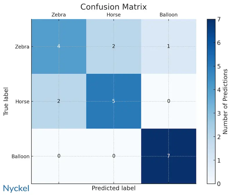
The above confusion matrix analyzes a model that classifies horses, zebras, and balloons. The predicted labels are plotted on the X-axis, with the actual labels on the Y-axis. This visualization it easy to identify the model’s weaknesses. For example, the model is good at recognizing balloons, but it struggles to distinguish between zebras and horses (out of 13 instances involving these two classes, it correctly identified the image just 9 times, a 70% accuracy).
This information is vital for troubleshooting and enhancing your model’s performance. In this situation, you might consider the following questions:
- Have I labeled the samples correctly? An incorrectly-labeled training sample can skew the model.
- Are the samples similar across categories? If one class contains blurry images, and the other is clear, the model could get confused.
- Do I have enough training samples? In our example, there’s only 7 for each, which is far too few in the real world. A first step here is to add more samples.
Ideally the confusion matrix would display a diagonal line with numbers (indicating correct predictions), with zeros in every other cell. That layout would indicate perfect model accuracy. However, achieving 100% accuracy is not only uncommon but would also suggest that your model is overfitting.
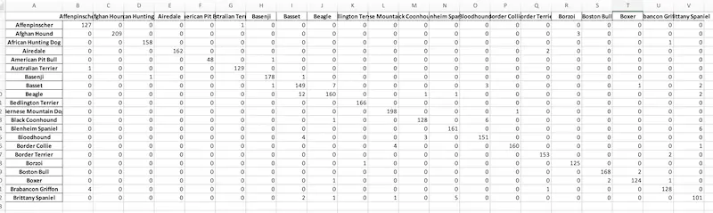
While confusion matrices can be visualized using the graphic above, that’s only feasible for models with roughly 8 classes or fewer. Beyond that, the chart can become unreadable. Larger matrices require alternative visualization methods, such as spreadsheets.
How does recall and precision fit in?
Recall and precision refer to two ways of analyzing class-level model performance. Alongside overall accuracy, they provide a good view of how well the model is doing.
| Accuracy | Recall | Precision | |
|---|---|---|---|
| What it measures | The percentage of total predictions that are correct, across all classes. | The percentage of actual positives correctly identified by the model, for each class. | The percentage of predicted positives that were correct, for a specific label. |
| Useful for understanding | The overall accuracy of the model. | The accuracy within a certain class. | How reliable the model is for a specific class. |
To calculate recall and precision, you can use the data from the confusion matrix. For instance, below is a matrix for a sentiment analysis model.
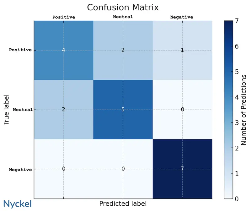
We can pull the recall and precision of, say, the “positive” class with the below formula, using the numbers in the matrix.
- Precision - Correctly-labeled as positive divided by total times the model picked positive = 4 / 6 = 66%
- Recall - Correctly-labeled positives divided by total positives = 4/7 = 57%
In our chart, the denominator for precision would be the sum of the numbers for the class’s X-axis, while for recall it would be the Y-axis.
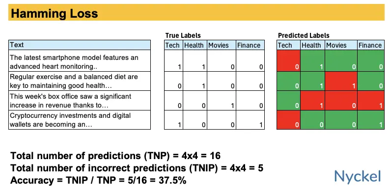
How does Hamming Loss fit in?
Confusion matrices work best for multiclass classification models, where only one winning class can be selected. By contrast, with multilabel classification, the model can return multiple relevant classes in a prediction. But trying to represent multiple correct labels in a single matrix is not particularly feasible.
Instead, if you have a multilabel model, you’d want to create a Hamming Loss table, which tracks the fraction of labels that are incorrectly predicted. Like with a confusion matrix, this makes it easy to visualize holes in a model.
How would I build a confusion matrix myself?
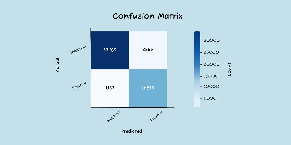
If you’d like to build these yourself, we recommend using Python and its prebuilt confusion matrix tools. Here’s an example script for building them. It’ll produce a confusion matrix png file for the input CSV.
import os
import pandas as pd
import matplotlib.pyplot as plt
import seaborn as sns
from sklearn.metrics import confusion_matrix

# Define the path to the CSV file
input_file_path = '/path/file.csv'

# Load the data
data = pd.read_csv(input_file_path)

# Specify the columns for true labels and predicted labels
y_true = data['Annotation Label']
y_pred = data['Prediction Label']

# Generate a list of labels from the data
labels = sorted(list(set(y_true.unique()) | set(y_pred.unique())))

# Compute the confusion matrix
matrix = confusion_matrix(y_true, y_pred, labels=labels)

# Create a DataFrame from the matrix for better visualization
confusion_df = pd.DataFrame(matrix, index=labels, columns=labels)

# Set the size of the plot
plt.figure(figsize=(10, 8))

# Set the font scale
sns.set(font_scale=1.2)

# Create the heatmap
sns.heatmap(confusion_df, annot=True, fmt='d', cmap='Blues', cbar_kws={'label': 'Count'})

# Add labels and title
plt.ylabel('Actual')
plt.xlabel('Predicted')
plt.title('Confusion Matrix')

# Rotate the tick labels for better visibility
plt.xticks(rotation=45)
plt.yticks(rotation=45)

# Adjust layout
plt.tight_layout()

# Save the plot as a PNG file
output_file_path = os.path.join(os.getcwd(), 'confusion_matrix.png')
plt.savefig(output_file_path, dpi=300)

# Close the plot
plt.close()

print(f'Confusion matrix saved as {output_file_path}')
Looking for a dev-focused classification tool?
Nyckel is a machine learning platform focused specifically on classification. Unlike most other tools, Nyckel offers elastic pricing (no more per-hour pricing!), automatic retraining after changes, and a way to track real-world usage in real-time.
You can learn more here.